![]()
For the past few weeks I have been working on mockups and the HTML/CSS for a new Fedora website, the Fedora Developer portal (likely to eventually live at developers.fedoraproject.org.) The goal of the site is to provide resources and information to developers building things on Fedora (not primarily developers contributing to Fedora itself.)
A bunch of folks have been contributing content to the site, and Adam Šamalík and Petr Hracek set up the initial first-cut prototype of the site, configuring jekyll to generate the site and building out the basic framework of the site. The prototype was shared with the Fedora Environment and Stacks Working Group mailing list, and after some feedback and iteration on the initial prototype, Petr asked me to take a look at the overall UX / design of the site. So that’s how I came to be involved here. 🙂
Competitive Analysis and Sitemap
First, to better understand the space this site is in, I took a look at various developer sites for all sorts of OS platforms and took in the sorts of information they provided and how they organized it. I looked at:
- Red Hat Developers – main nav is streamlined – solutions, products, downloads. Also has community, events, blogs. Large banner for features. Has a membership / join process. Front page directory of technologies under the solutions nav item.
- Microsoft Windows Dev Center – main nav is a bit cluttered; core features seem to be developer docs, downloadable tools, code samples, community. Has a “get started” beginners’ guide. Features blog posts, videos, feature highlights. Has a log in.
- Android Developers – main nav is “design | develope | distribute.” Features SDK, code sample library, and videos. Has case studies. Also has blog and support links.
- Apple Developer – main nav is “platforms | Resources | Programs | Support | Member Center.” Has a membership program of some sort with log in. Front page is not so useful – solely promo banners for random things; full footer that extrapolates more on what’s under each of the main nav items. Resources page has a nice directory with categorized breakdown of all the resources on the site (seems like it’d make a better front page, honestly.) Includes forums, docs, and videos.
- Ubuntu Developer – cluttered main nav, nav items contain Ubuntu-specific jargon – e.g. not sure what ‘scopes’ or ‘core’ actually are or why I’d care, has a community, has a log in. Has blog and latest events highlights but they are identical. Similar to Apple, actually useful information is pushed down to the full header at the very bottom of the page – including SDK, tutorials, get started guide, how to publish apps, community.
One thing that was common to all of these sites was the developer.*.com URL. (developer.windows.com does redirect to the dev.windows.com URL.) I think because of this, developer.fedoraproject.org seems like it would match the broader platform developer URL pattern out there.
Another thing they seemed to all have in common were directories of technologies – frameworks, platforms, langauges, tools, etc. – affiliated with their own platform. Many focused on deployment too – mostly to app stores, but deployment nonetheless.
Looking at the main structure of the site in the initial prototype, I felt it honestly was a pretty good organizational structure given the other developer sites out there. I wanted to tweak some of the wording of the headers (to make them action-oriented,) and had some suggestions as to additional content pieces that could be developed, but for the most part the prototype had a solid structure. I drew up a sitemap in Inkscape to help visualize it:

Mockups
With confidence in the site information architecture / basic structure of the content, I then started mocking up what it could look like. Some things I considered while drawing this out:
- The visual challenge here is to give the site its own feel, but also make sure it feels like a part of the Fedora ‘family,’ and has a visual design that really feels related to the other new Fedora sites we have like getfedora.org, spins.fedoraproject.org, and arm.fedoraproject.org.
- There should probably be a rotating banner feature area where features and events could be called out on the front page and maybe even on subpages. I don’t like the page full of promos that is the Apple Developer front page – it comes off as a bit disorganized IMHO – so rotating banners seemed preferable to avoid banners taking over the whole front page.
- The main content of the website is mostly a series of simple reference guides about the platforms, frameworks, and languages in Fedora, which I understand will be kept updated and added to regularly. I think reference material can appear as rather static and perhaps stale, but I think the site should definitely come across as being updated and “living,” so featuring regularly updated content like blog posts could help with that.
So here’s what I came up with, taking some article content from developerblog.redhat.com to fill in the blog post areas –
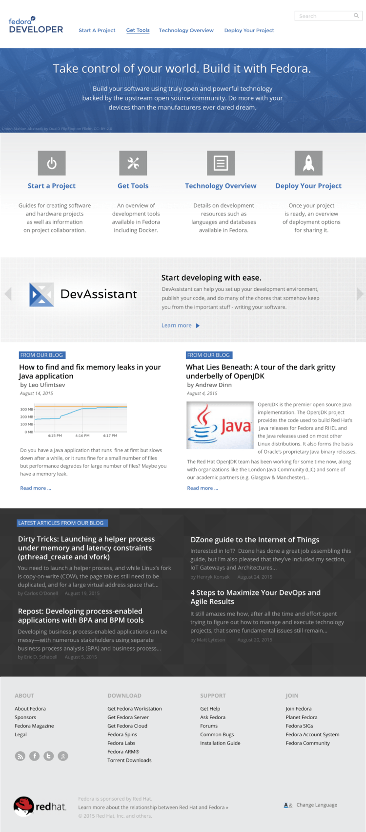
A few notes about the design here:
- To keep this looking like it’s part of the Fedora family, I employed a number of elements. I stuck with a white background horizontal branding/nav bar along the top and a fat horizontal banner below that. It also has the common Fedora websites footer (which may need some additions / edits;) and a mostly white, blue, and gray color palette. The base font is OpenSans, as it is for the other sites we’ve released in the past year. The site still has its own feel though; there are some little tweaks here and there to do this. For example, I ended up modifying the front page design such that the top banner runs all the way to the very top margin, and recedes only on sub pages to show the white horizontal background on the top header.
- There is, as planned, a rotating banner feature area. The example in the mockups features DevAssistant, and the team already has other feature banners planned.
- Blog content in the form of two featured posts as well as a recent blog headlines listing hopefully will inject a more active / current sense to the overall site.
- I made mockups for each of the major sections of the site and picked out some CC-BY licensed photography roughly related to each corresponding section in its title banner up top.
HTML/CSS
Petr had also asked if I’d be able to provide the CSS, images, and icons for the site once the mockups were done. So I decided why not? The framework he and Adam used to set up the site was a static framework I was not familiar with – Ruby-based Jekyll, also used by GitHub Pages – and I thought it might be fun to learn more about it.
Jekyll
If you check out the tree for the website implementation, you’ll see a bunch of basic HTML files as well as markdown (*.md) files (the latter mostly in the content repo, which gets set up as a subdirectory under the website tree when you check the project out.) Jekyll lets you break down pages of the site into reusable chunks (e.g., header, footer, etc.), and it also lets you design different layouts that you can link to different pieces of content.
Whether any given page / chunk of content you’re working on is a *.md file or a *.html file, Jekyll has this thing at the top of each file called ‘front matter’ where you can configure the page (e.g., set which layout gets applied to it,) or even define variables. This is where I set the longer titles for each page/section as well as placed the descriptions for the sections that get placed in the title banner area.
Bizarre Jekyll Issue
Insert random interlude here 🙂
So I ran into a crazy, probably obscure issue with Jekyll during this process – due to my being a newbie and misunderstanding how it worked, yes, but Jekyll did happily build and spew out the site without complaint or pointing out the issue, so perhaps this little warning might help someone else. (Red Hatters Alex Wood and Jason Rist were really helpful in trying to help me debug this crazy issue. The intarwebs just totally failed on this one.)
I was trying to use page variables when trying to implement the title banners at the top of every page – I needed to know which page I was on in order to display the correct page title and description at the top. The variables were just spitting out blank nothingness in the built page. It turns out the issue was that I was using *.md files that had the same name as *.html files, and some variables were set in one file and some another file, and Jekyll seemed to want to just blank them all out when it encountered more than one file with the same base file name. I was able to fix the problem by merging the files into one file (I stuck with HTML and deleted the *.mds.)
Here it is
So the implemented site design is in place in the repo now, and I’ve handed the work back off the team to tweak, hook up functionality to, and to finish up content development. There is a development build of the website at developer-phracek.rhcloud.com, but I’m pretty sure that’s behind from the work I finished last week since I see a lot of issues I know I fixed in the code. It’s something to poke around though and use to get a feel for the site.
Want to Help?

If you poked around the development version of the site, you might have noticed there’s quite a bit more content needed. This is something you can help with!
The team has put together a contribution guide, and the core site content is basically formatted in Markdown syntax (Here’s a neat markdown tutorial.) More information about how to contribute is on the front page of the content repo in GitHub.
Thoughts? Ideas? Need help contributing? Hit me up in the comments 🙂


Fedora Developer Website Design http://t.co/0UHDI0kA3G http://t.co/vaQgIU5gGH
Máirín Duffy: Fedora Developer Website Design http://t.co/nBV1uHORh1
Máirín Duffy: Fedora Developer Website Design http://t.co/z331dDxqmk
Fedora Developer Website Design: For the past few weeks I have been working on mockups and the HTML/CSS for a … http://t.co/YQcBOTwjxa