This post is just a little bit of thinking about a particular warning dialog in the Fedora installer. There is a ‘just for now,’ simple, low-churn solution to the issue, but the larger problem remains unsolved. I’ve also documented this saga in the Fedora wiki for posterity. It’s what I’ve been looking at over the past couple of days.
The problem

Background
See the screenshot above? Scary little bugger, right? Yep, there’s a few issues with this screen. We’ve received bugs on it requesting that the text be changed to be more accurate. There’s bigger problems than that, though.
Let’s go a bit into the background of this dialog. It occurs early on in the screen flow:
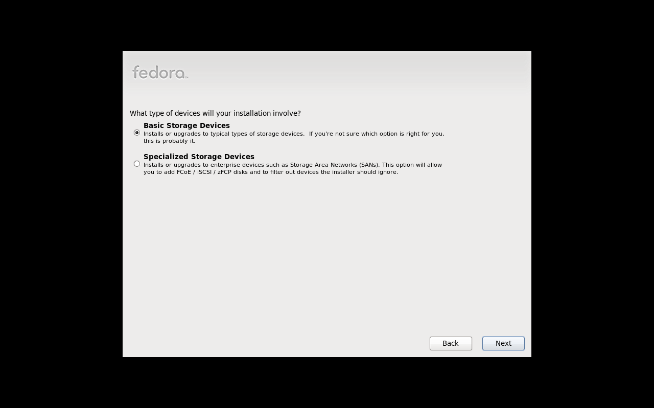
[ lang selection ] => [ keyboard selection ] => [ basic or special storage ] => [ REINIT DIALOG ] => [ hostname selection ]
Here’s the full order of things in the anaconda code.
The screen that asks if you have basic or specialized storage must come towards the beginning of the screen set, because it is at this point anaconda has to scan to see if any pre-existing installations are on the system in order to know if we can upgrade a pre-existing system or not. However, we don’t want to scan specialized storage devices which may be mounted to the machine if we know for sure that the user isn’t interested in using them as part of the install – it’ll take a while, it may spins up a lot of devices that were not active using more electricity, putting wear on equipment, etc. hitting a lot of networks.
- If you pick basic, anaconda just scans local devices.
- If you pick specialized, anaconda scans local devices & network storage devices. This route also gives you the option of adding iscsi and other kinds of disks that require user input to be able to discover.
There may be a false assumption here – someone may want to use specialized storage devices as install targets, in which case scanning them for upgradable bits makes sense. However, someone may also simply want to use specialized storage devices as mounted data storage, in which case we shouldn’t bother scanning them for upgradable bits.
Anyhow, once we know which devices to scan (local if basic, local+network if specialized), they are scanned and if any of them appear to have missing partition tables, this dialog is popped up.
Anaconda may not know how to read the partitions on the drive, another operating system may be able to. There *could* be data on that drive, but we just don’t know because we don’t know how to read it. The drive may very well be blank (if it’s brand-new / baremetal) or it could be a virtual drive and have no data either. So our dilemma is:
- we can’t mount the drive as a data drive if we can’t read the partitions, so it’s useless.
- we can’t use the drive as an install target unless we completely format it.
- there may be data on the drive, we just don’t know. if we reinitialize a drive that was only meant to be a data drive… we’re erasing data for no good reason.
- there may not be any data at all in which case popping up the dialog instead of just reinitializing the disk and being quiet about it without causing so much bother.
Problems

Here are the problems you can see just looking at a screen surface level here:
- The titlebar says warning. The text says error. The icon indicates a question. These are all in conflict with one another. This dialog is more of a warning dialog than anything else.
- The metadata about the drive in question is strewn all over the dialog and hard to read.
- The dialog uses the word ‘reinitialized’ and ‘re-initialized’ multiple times without explaining what it means.
- THE DIALOG USES ALL CAPS
- The dialog says that re-initializing will cause all data to be lost, but actually, it will only cause data on the drives being reinitialized to be lost, and only if there was any data in the first place (which there might not have been.)
- Four buttons across the bottom of the screen is a bit of an overload, yet if we had say 100 such devices attached to the system (slices of a network drive maybe) then we would see this dialog 100 times without those extra ‘all’ buttons.
- What does ignore do? Ignore what? Ignore this warning and go ahead an re-initialize? Wait a minute… (It actually ignores the drive in question, removing it from the set of drives considered in the install process)
- Overall, the dialog is scary, and this fright is brought up in situations that should not be frightful – e.g., you’re simply installing on a virtual machine with a virtual disk. No need for the scare!
Design Challenges
Here’s some of the things that make resolving these problems a bit dicey:
- Two classes of users who simply don’t care about this dialog and for whom it’s a waste of times / click effort are users installing virtual machines and users who have brand new hard drives. The default choice of reinitializing all soothes these folks.
- This dialog might come up towards the beginning of the installer screenflow, or closer to the partitioning screen. There are two storage device scans that happen – because some drives (like iscsi drives where you need to manually input address information) can’t be scanned for until you hit later screens.
- We need to prevent users from clicking next-next-next and destroying a drive (That they might not necessarily own if it’s networked!) by accident. This is one reason the dialog is currently a dialog rather than a regular screen. It’s difficult to remove the next & back buttons in the middle of the screen flow.
- There’s a big difference between what this reinitialization thing means for data drives vs install targets. Data drives are added in anaconda so automounts can be set up. We can’t mount a drive that we can’t read. While it sucks, it’s far less sever than the other case, in which an install target can’t be used unless we wipe it.
- We can’t move the basic vs. specialized selection screen to be with the rest of the storage device screens, because it’s the scan that takes place here that determines if an upgrade is possible (it examines the drives, looking for pre-existing & upgradeable installations.) The problem here is that it’s really not smart to just go scanning any network drives available for pre-existing installs unless we know for sure the user intends us to do that.
Questions
So looking all of this over, here’s some questions that might come to mind:
- Is the default choice of ‘reinitialize all’ the right choice? (Not sure. We make a choice here between making life easier for virt installs or making life easier for folks who don’t want to lose data. We don’t know how large these populations are relative to each other.)
- This dialog is separated from other storage-related screens. Can we move it closer to the partitioning screen? (Maybe.)
- Reinitializing currently affects all drives scanned, without any filtering by the user (besides the local or local+network drives selection). Can additional filtering be added?
- Reinitializing currently affects drives meant to be part of the install target set AND drives merely meant to be automounted to the system. Can we limit it to only install-target drives?
- If a user really cared about the data on a drive, would they really select it as an install target? (Probably not.) In that case, do we need to warn them that data might be lost if they use a drive with an unreadable partition table as an install target? We already warn them that any drive used as an install target will be wiped!
Mockups & Ideas
The radio-button approach
In this approach, we think about the different types of users who might encounter the dialog and offer those users who have any data to lose an easy way to avoid the entire reinitialization screen and its related stresses.
We only display the radio button dialog If one or more missing partition table drives are detected. If the user says the device is virtual or blank, we reinitialize it without asking. If the user says the drive had been used before or they weren’t sure, we give them the scary reinitialization screen.
Some issues with this idea is that it’s not very scalable – you have 100 drives you can’t read, you get this radio button dialog for 100 drives. Ouch. We could potentially provide a list view of all unreadable drives, but right now anaconda pops them up as it goes. It may be possible to poll all the drives first, cache the data, and then present a list, though. It’s simply not possible in anaconda right now. But with a list of multiple drives, the multiple choice selection won’t work any more – each drive might be different. Um, so maybe not the best idea – or at least, this approach needs more work.
If you remove all the drives from the install to protect them you get the last dialog – we can’t install if there’s nowhere to install to. 🙂

The text-massaging Approach
This is a less-weighty approach to apply in the meantime, without a lot of underlying code change. Except, oops, it does require too many underlying code changes. Right now there’s no caching of drive data, so the dialog pops up as anaconda scans drives and detects missing partition tables. So anaconda doesn’t know, until it knows, that a drive is unreadable. So the multiple list view won’t work here.
It’s a better approach than the next one though, which is more compromising to the current state of anaconda’s functionality. One thing to note here – if you have one drive that can’t be read, you see the first screen. If you have more than one drive that can’t be read, you see the second screen. So the mockups in this screen are either/or, they are not a sequence.

The text-massaging approach – simpler
This approach caused the least code churn so it’s the one we’ll go with in the meantime we figure out the larger problems here.
Note the button text has been changed – it says ‘Yes, discard any data’ and ‘No, protect any data.’ We say any data because there may not be any data at all. Saying ‘discard data’ makes it sound like there actually is data to be discarded. We say ‘discard’ rather than ‘destroy’ because it’s a little less frightening of a word I think.
Rather than having four buttons along the bottom, we have two that apply to the single device in question. For our virt-installing friends, we have a checkbox that will enable the button to apply to any such devices.
So while we have a new layout and new language, the functionality is unchanged.

Where to go from here
One idea could be to show the list of drives and ask the user if there is any data they care about on those drives, because we can’t read them and will need to erase them to use them in install. Then give users the options to remove them from the install process / protect them one-by-one with the option to check off the drives they care about the data on. (or vice-versa, check off which drives they want to use for the install.)
We originally had mocked up the latter during the Anaconda storage UI redesign – showing all the drives we found and allowing users to check off the ones they wanted. This was removed at the last minute because of complaints that we ask for too much information about storage devices in the UI. I think part of the problem is because we only worked on the storage UI, not the entire anaconda ui, so there was some redundancy or at least the appearance of such. This time around hopefully we’ll get this right since we’re looking at the entire UI.


I'd suggest the buttons should make sense if they read none of the rest of the text. Remove the "Yes, " and the "No, ". There is no need to pose a question. Having two buttons poses a question.
Perhaps even add to the buttons: "Protect data and ignore device" and "Discard data and use the device." Perhaps, "use" might be "erase" or "format".
-Arthur
You criticise the extant dialogue by saying it doesn't define "reinitialized". Well, yours doesn't define "virtual". My grandmother would ask WTF is a virtual disk.
Hi Bob,
First, I would like to ask that you do not use examples that reinforce negative (and unfair) gender and ageist stereotypes.
Consider in what scenarios a user would encounter this dialog. In the vast majority of scenarios in which a user encounters this dialog, it's because they are creating a virtual system. If a user creating a virtual system does not understand what virtual storage devices are, they have problems this dialog won't ever be able to solve. 🙂
The other scenarios in which this user would encounter this dialog:
– They have a brand-new harddrive. I think less technical users would probably purchase a computer from best buy or dell that already comes with an OS preloaded, meaning they won't have a blank hard drive. I believe (and I could be wrong, let me know) most desktop systems these days come pre-loaded, unless you build the system yourself, of course. If you're building your own system – well, you know what you're doing. Servers come baremetal and blanked out but again, it's a technically-knowledge person doing installations on servers. (Certainly knowledgable enough to have heard of virtual machines.)
– They destroyed the MBR on a drive with data on it. I'm not sure how less technical users would get themselves into this sort of pickle on their own?
In summary, I'm not sure the use of the term "virtual" is really as much of a concern as you state. The thing is, referring to virtual in this dialog is referring to a key word that will be meaningful to many, many of the users who will actually encounter this dialog. The term 'reinitialized' may not mean anything to them.
Also, why do you have the title "Storage Device Warning". You already have the larger, more prominent, "The storage device below may contain data." Why the need for the two titles? Why not drop the upper one?
What does the user do if they don't understand the terms used or the implications? Why not a help button.
What if the user wants to go back to the previous step?
Why the icon of a hard drive? Do users know what a hard drive looks like? Is it helpful? Would anyone see the icon and think "aaah, they're talking about one of those".
I think you could pick just as many silly holes in your design. Your design is just different – no better.
Hi Bob,
First I would like to thank you for your time and effort in reviewing this dialog. I have to apologize as it seems I was not clear in explaining that:
#1 this design is not finished. we only have a short-term, quick fix. to solve this for the longer term, it's not going to be helpful to look at the surface of this dialog. Rather, we're currently taking a 10-foot step back to look at the dialog's place within the entire install process and I even am pondering a solution that involves rearranging the order of screens so as to make this dialog unnecessary. So this dialog may go away completely – in which case I'm afraid your feedback won't be of much use. 🙁
#2 we needed to address the issue according to a user's complaint very quickly, meaning we had the constraint of not requiring much code churn and limited as many of the changes to be string or cosmetic only. the current short-term solution achieves this.
"Also, why do you have the title “Storage Device Warning”. You already have the larger, more prominent, “The storage device below may contain data.” Why the need for the two titles? Why not drop the upper one?"
I thought I explained this in the original blog text – my apologies if I did not – but we needed to limit our short-term fix to be as minimally impactful as possible. Unfortunately, while I would love to kill the pop-up dialog and instead integrate this choice into the main installer, that would have been too invasive a change. For example, it kind of becomes a bit of a jenga tower, because then a user can keep hitting next-next-next-next and they could potentially wipe data. In anaconda, the general philosophy is to try to minimize accidental deletion of data as much as possible.
One limitation of this dialog, which I also thought I explained but I may have not explained it very well, is that it comes at the beginning of the installation process. If your computer is connected to say network storage devices, and you choose the specialized devices route, any network devices found which anaconda can not read the partition of could be blown away if you keep hitting next-next-next-next. The problem? Maybe (1) you don't own that drive, it's just on the same network, (2) it's got a different OS or was created by a different OS for which we can't read the partition table, but is perfectly valid for that OS. Okay, so then you could argue, "but surely network storage administrators harden down their devices such that only folks who are authorized to see a device can see it and no one else," or "surely important data wouldn't be sitting on the network like that." As I've been told both by the developers involved and folks in the field – these networked devices are difficult to administer and are not always secured properly, which is why anaconda takes such a conservative stance on data destruction. (for every paranoid step anaconda takes I'd bet there's a least a few bugs where someone lost data and asked for the change.)
Rather than dealing with this unravelling sweater of problems, we deliberately decided to keep this pop-up dialog as a pop-up dialog.
Seeing as it is a pop-up alert dialog, we followed the GNOME HIG guidelines, which is why the title and heading are as they are in the mockup:
http://library.gnome.org/devel/hig-book/nightly/w…
"What if the user wants to go back to the previous step?"
See above. We needed to stay within the current framework for our temporary fix here.
"Why the icon of a hard drive? Do users know what a hard drive looks like? Is it helpful? Would anyone see the icon and think “aaah, they’re talking about one of those”."
Certainly I could imagine someone electing to self-install an operating system who had never seen a hard drive before, especially with the proliferation of laptops. While I do think the icon looks close enough to my WD external USB drive (which are quite common these days, as well as other vendors') to be identifiable as a hard drive in either case, the important thing here is to not identify it as a har drive, but just to identify it as a device. I think the icon provides some context – this is a single device we're talking about – behind the vendor ID string and device path which I think would otherwise be a bit more confusing. Placing the text closer together and relative to the icon (think gestalt rules) makes it clear the identifying information is related to a device of some sort.
Yeh, this gets weird and mind-blowing in the case of virtual disks, but a lot of virtual system management software i've seen uses HDD icons for virtual drives.
"I think you could pick just as many silly holes in your design. Your design is just different – no better."
I did say this is not a final design, that it's only a temporary solution – essentially lipstick on a pig. It's true – it is no challenge to poke holes in this design – we had a lot of constraints we had to juggle, and ultimately could only make simple changes.
That being said, I think you are being quite unfair by saying the new design is different not better. Can you honestly tell me that: https://fedoraproject.org/w/uploads/thumb/7/76/St…
is no better than
https://fedoraproject.org/w/uploads/thumb/5/5b/An…
even if it's only in layout & organization?
For the record, the original bug reporter I've been working with did feel it was an improvement and is happy with the proposal.
Ha ha trolled
the actual Q "Are you sure … " needs to emphasised either bold or in a larger font.
Why?
Because he fucking said so, whore.
Bob, that is uncalled for.
Hey scum,
Stop with the disgusting insults to my daughter. If you're man or lady enough I'd be overjoyed to meet you personally anywhere anytime to discuss this further. In the meantime chill.
Mr D
You need a good washing out of your filthy mouth with a big bar of LAVA soap. Your comments are reprehensible. This site should block any further garbage from you. You don't deserve this wonderful opportunity to share your thoughts in a public forum.
Just stop using Anaconda as an installer…problem solved. Why it is still being used is beyond me considering the more robust solutions out there.
What's a more robust solution?
I like the idea of seeing all drives that will be involved in the transaction as I make my choice much like idea2,bottom screen has.
Often I always question why "initialize" is used when you're simply about to "format" and/or "partition" the drive. Most people who aren't tech-savvy that I've run into are confused until I say "reinitialize means it wants to format the drive", then they react with "oooooh, why can't it just say that".
In designing UIs at my work I've found that the 'average' person understands an interface much more quickly and often when there is very little to read. When you lump a paragraph in there about something that's supposed to be simple and rapid (like an OS installation) people just skip right over it and then don't completely understand what they're doing.
In my opinion I would say have the list of drives involved at the top and state that all drives listed will be formatted/wiped/reinitialized (whatever's best), and then very simply point out that "No valid partitions were detected on these drives. If this/these drive(s) contain data, understand that this data will be unrecoverable after proceeding."
Then give a choice to "Remove drive from list" "Proceed with disk format/wipe/initialization"
It's simple. If I made a mistake then I'm thankful for the ability to see the whole picture and make a last minute change to save my drive w/ data on it. If I'm just formatting blank drives or virtual disks, I'm thankful that I'm not bogged down with excessive wording that tries to cover all end-user cases with explanations of possible scenarios.
I don't know about anyone else, but I appreciate confirmation boxes that let me change things on-the-fly before I confirm major decisions like formatting a drive array that may or may not be the one w/ all my data. This also eliminates the need to "go back".
I think you're dead on with the title/icon issue, I like what you used.
Or in a completely different twist:
Idea2-bottom pic. Keep the title/icon,etc. and just say the 2 lines:
"We could not detect…."
"Are you sure…."
And give a choice of [ Yes, proceed with format/wipe/intialization ] – [ No, revise drive selection ]
Revising the selection allows u to check/uncheck disks involved in the transaction either by taking you 'back', or by presenting the user with an extremely simply check/uncheck interface involving the drives in question.
"Often I always question why “initialize” is used when you’re simply about to “format” and/or “partition” the drive. Most people who aren’t tech-savvy that I’ve run into are confused until I say “reinitialize means it wants to format the drive”, then they react with “oooooh, why can’t it just say that”."
Agreed 100% and that was exactly my reaction the first time I saw this dialog when creating a virtual guest.
"In my opinion I would say have the list of drives involved at the top and state that all drives listed will be formatted/wiped/reinitialized (whatever’s best), and then very simply point out that “No valid partitions were detected on these drives. If this/these drive(s) contain data, understand that this data will be unrecoverable after proceeding.”"
I really like this suggestion, and I think I'll mock it up to put it on the table (although it'll be a longer-term-solutoin candidate – in the short term we really can just change strings and move widgets around and that's about it.) I really like your suggestion for the second mockup too.
Thank you so much for the productive, polite feedback. I really appreciate it!
Very interesting. Thank for taking the time to write it up. I'm learning from your write-ups about design. Some comments from my side:
I like the idea of the radio button, as it presents choices to the user in terms that might be more understandable. In other words, the questions would be closer to what they will be thinking, rather than closer to the risks/actions.
The second and third ideas look quite usable, but some comments if you are interested in my opinion:
There is a lot of text, which is mostly good since it is very informative. I'm just wondering what a user will do if they don't want to read and skip visually down the dialogue. Hopefully the button text is scary enough that they go back and read it! If someone didn't read all the text (or went through it too quickly), I'm wondering if the "protect" button will create the right impression. Is it about protection, or is it about leaving it alone/ignoring it? No backup will be made. I'm wondering if such an impression might be created.
For all except the list approach, I would consider emphasising the size (8.2GB) a bit more (maybe just bold). It is one of the most accessible pieces of information, and depending on the setup, might even uniquely identify the drive. The name might be more complete, but I think some people might read the size more easily than the device name, which often contains product version numbers and such uninteresting things.
For the case of a virtual drive, I want to challenge you a bit: what is the difference between an uninitialised virtual drive and an uninitialised physical drive? Well, there is a difference, but in terms of what will be done, there is no difference. I like how you identify users of virtualisation as a frequent use case, but it is receiving a lot of emphasis now, and in the first design, it appears to require unique handling by anaconda if chosen, which it won't (if I understand it correctly). Where you talk about "blank, unpartitioned, or virtual", would it be possible to simply say just "new" or "empty"? You are trying to say "it could be empty, or there could be data, but we don't know and need your help". Mentioning "unpartioned" and "virtual" to me seems to make "empty" just sound more technical, but maybe I'm missing something.
Then a challenge to the developers, which might help in the design: Isn't it possible to detect most common types of virtualised hard drives? Even then we should probably not make assumptions, but if it says "ATA VBOX HARDDISK" we might just want to confirm with the user that this is a new virtual disk that needs partitioning.
With all of these I'd suggest running it by someone working on internationalisation before finalising this. I know it feels way too early to think about it, but since you are playing with wording here to obtain your goal, realise that a lot of users might not be using it with the English text that you wrote. So we need to check that it will be translatable while reaching the same goals. Comments for translators would be very helpful in this case, otherwise you risk ending with something worse than you think left your hands 🙂
There really is no difference between bare-metal drives and virtual drives. Either one may be blank, have another OS on it, be part of a LVM, etc. so we need to treat them as equals. I like the dialog for single drives and list box for multiple drives approach myself. That would be an improvement of our current method of displaying a dialog for each unrecognized drive.
There are two shortcommings in Your approach:
a) if more than one device are connected, You should enable to individually choose which drive to formate and which not.
b) You should probably include some utility that shows what's on the drive (i.e. include a button "Inspect drive"), that will show what partition types and data are there…
Hi Xurfa,
Both of those are great ideas we definitely considered, but are simply not possible for a quick fix right now. The code loops through one by one and does not cache the data. Look at my notes & comments on the second design.
I am not using Fedora myself but imo that is really a great improvement!
Sometimes when I encounter dialogs like the one you started from I wonder what happens when exercising either option.
What I really like is that you did a nice job emphasizing what is at stake here.
Btw. often when I see mockups I wonder how they are created. How did you create yours if I might ask?
Thanks, I'm glad that you enjoyed the writeup.
I use Inkscape for all of my mockups. I have a presentation I give on how I do it that I'm happy to share:
http://mairin.wordpress.com/2010/08/02/creating-u…
The video takes a while and the quality isn't great, so I recommend the slides.
In reading this I am reminded why I don't allow for unmoderated blog comments.
It's moderated. I let most of his comments through. With the timing of Val's article in LWN this week I thought it might be interesting to showcase the misogyny.
What I really don't like about the radio button dialog is that 4 possible answers perform only two different actions. So I would appreciate a way to make a little bit more clear that a pair of two does exactly the same. I don't like to have to dig through source code to come to that conclusion.
Also I don't really get the seperation of physical drives that are blank and virtual drives that are blank. When they carry data, we handle them exactly the same. Why change that just because they are empty? Actually, we don't even do that. We'd only create the impression that we do by offering different options. I don't believe this has any benefit for users. Why should one think that a freshly created virtual disk is anything but blank?
What's wrong about:
[ ] blank/unpartitioned (applies to freshly created virtual disks)?
Aside from that: nice work. This dialog really wasn't the prettiest thing I can think of.
perhaps,
"No, keep existing data"
The word 'protect' is not simple.
Thanks for the suggestion; we changed the dialog as you suggested since we agree 🙂
As someone who just installed Fedora on a new, empty drive, I'm afraid I'd have to take issue with this comment:
Two classes of users who simply don’t care about this dialog and for whom it’s a waste of times / click effort are users installing virtual machines and users who have brand new hard drives. The default choice of reinitializing all soothes these folk
I'm a fairly technical user, very used to Linux but a first-time Fedora user. The combination of those factors might mean that I put myself into this situation: To wit, I had installed the new drive in my laptop, and had the old drive connected in an external case via eSATA.
The default choice of "Re-initialize all" frankly scared the pants off of me (or rather, thinking "what if I'd just blindly accepted the default?" scared me). The whole point of having my old drive in the external case was to be able to consult my old partitioning during the install and have the data available once Fedora was installed.
So like I said, perhaps I put myself into that situation (not too many people are interested in their old partition tables). But I definitely think that "all" was overly ambiguous. "All partitions [on the same drive]", "all partitions [on all drives]", "all data [on one partition]", …? Sounds like I made the right choice by choosing the plain "Re-initialize".
All perhaps a moot point now, but wanted to share. Also, I'll keep fingers crossed for that deeper rewrite you mentioned which adds that "memory" of all drives/partitions, so that the user can make a global choice in a single step with full visibility instead of having to deal with each drive in its own, isolated step.
Thanks this is great feedback!
You're welcome. Thanks for gathering the comments! I'll look forward to the results in some future version.