I wanted to give a huge thanks to everyone who responded to my Weighty Asynchronous UI Patterns post – I received a ton of helpful and insightful comments.
I’d like to summarize the discussion into a set of patterns for future reference using the feedback you all gave me. So here we go:
Formatting “In-Place” / Javascript Expansion Links
- Use a downward arrow:

- Use a disclosure triangle widget:
- Use the following types of text in the link text itself:
- “Expand”
- “Expand this”
- “Expand rest of comment”
- “Show more”
- Examples:
- Use a [+] / [-] expansion widget:
- Use a collapsible panel widget


Formatting “Real” Links that Necessitate a Full Page Load
- Use a forward arrow or other icon to signal a fresh page load:
- Use the following types of text in the link text itself:
- “Read More at foobar.com”:
- “Jump to full post”
- “…”
- “Read More at foobar.com”:


Ambiguous Link Treatments that Can Make the Link’s Weight Confusing
- “read more”
- >> – comments seemed divided as to the meaning of this one.
General Tips for the Treatment of Links
- Opening links in a new browser window appears to be universally hated, so don’t do this. Just use a normal link and let users decide how to open it using their browser controls.
- If you can, add a “title” attribute to your link tag with information to help users determine the weight of the link.
- Consider making both a “real” link and a javascript “expand” link available, labeling both clearly using the techniques suggested above
- I’m not sure where lightboxes come into play in all of this. Since they are not very common and thus not to be expected, they should probably be delineated with a link.
- In general, I think most users expect links to be “real” links, so if it’s not a real link – if it’s an in-place expansion, lightbox, or something else, mark those links as being special, and leave “real” links plain.
- If you must pop open a new browser window or pop up, the following types of icons are probably good to use to signal this:

Other Resources
- Should Links Open in a New Window? by Darren Rowse at ProBlogger
- Collapsible Panels UI Pattern at Welie.com
- Chapters on Design for Rich Internet Applications by Dani Malik at experiential.vox.com
- AJAX Patterns: Functionality and Usability Patterns
By the way, I made all the icons used in the examples above for this post. If you like any of them feel free to cut them out and use them under the public domain.
Postscript: Codebeard asked a good question in the comments: what did we end up doing in Fedora Community? Luke Macken helped me fix it as shown in the animated gif below:

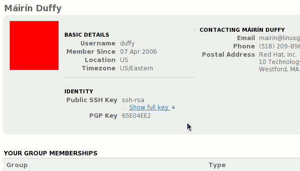
As a special bonus, here’s the same pattern applied to viewing SSH keys in Fedora Community user profiles. (*ahem* someone has been having too much fun in Gimp today, eh? 😉 )


Wow, great job. I'm impressed by how quickly you put all of this together.
I think I'd be happy with almost any of these, so I guess it's now just a matter of which behaviour do you want to implement?
@codebeard: hey thanks 🙂 i ended up using the downward arrow in Fedora community. and it came out awesome, I used jquery. I'll post an animated gif to the post to show it 🙂
Awesome post!
@Marius: hey thanks 🙂 glad you liked it
[…] more paintain. Posted in Uncategorized by mairin on June 11, 2009 As I’ve blogged about before, in the past few months I’ve been working a lot on Fedora Community with John Palmieri […]
[…] icon to indicate the upstream webpage links are outside of Fedora infrastructure (see “Patterns for Expressing Expansion Link Weights in Web Applications” and “More Link […]